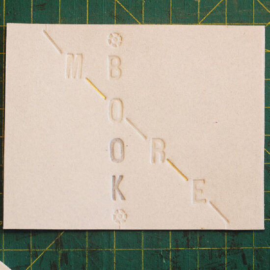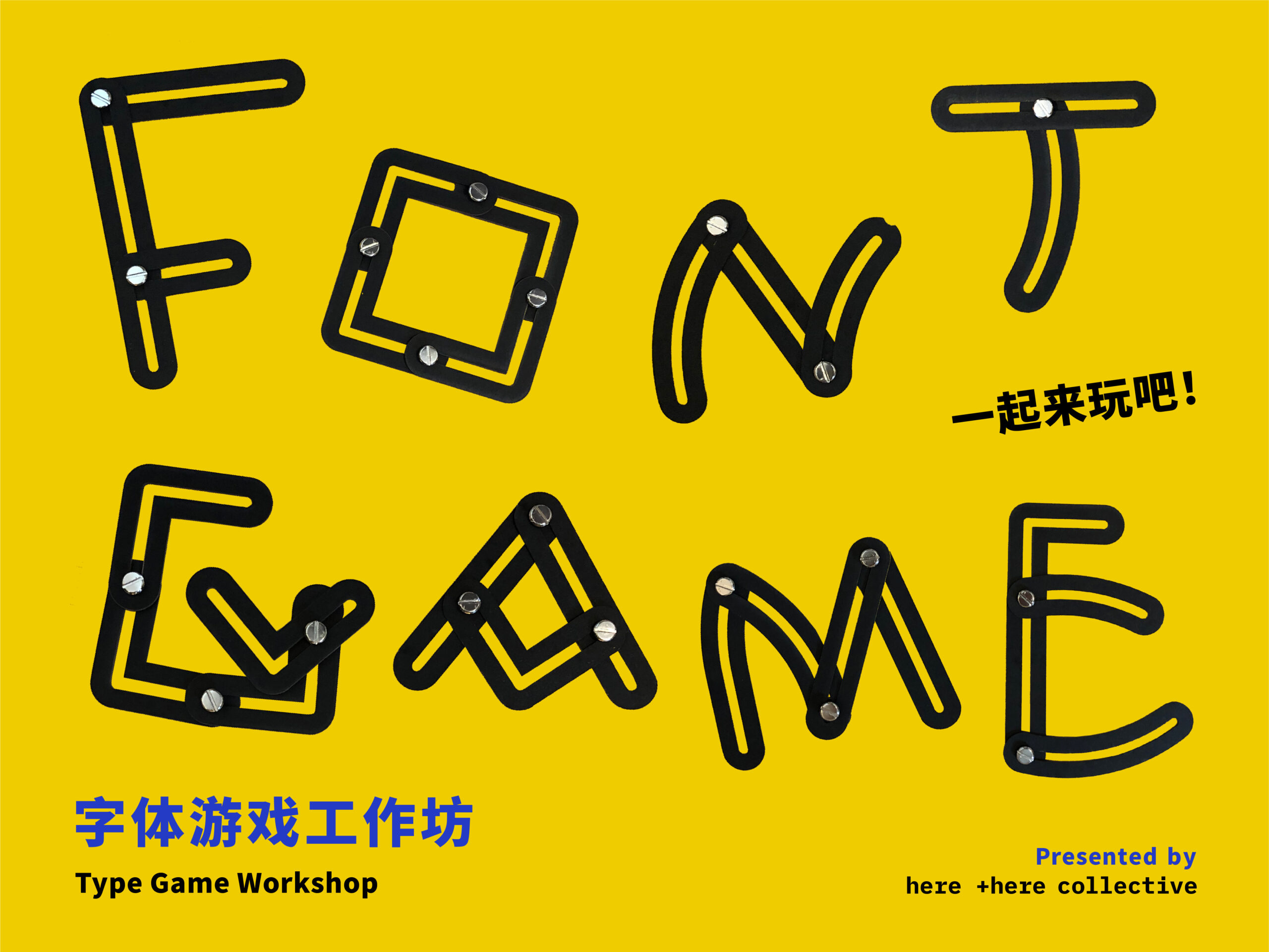
字体设计与时间堆砌
Typography & Time Bricking
内容介绍:
字体设计有两层重要信息,一层是字体有极简呈现的潜质;另外一方面,字母是文学的基本元素。
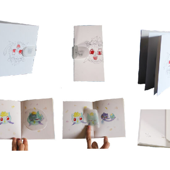
在字体设计过程中,工作的常态是做非常多的测试,从中做出选择或遵循,遵循字母发出的声响,遵循它们想要组合成各种词组或者文本而互相发生关联时,其背后所隐含的逻辑和戏剧化的反应。
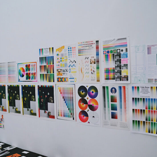
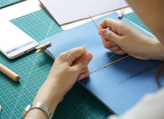
面向字库的字体设计工作也是一种时间消耗的方法,也是堆砌时间以及对其进行雕塑的过程。
There are two layers of important messages in typography, one is that fonts have the potential of minimalist display and the other is that letters are the basic elements of literature.
The normal status of typographic process is to do a lot of testing. We need to make choices or to follow, to follow the sounds that letters make, to follow the hidden logic and dramatic reaction behind them when they are combined into various phrases or texts.
Designing a text typeface is a time-consuming method and also the process of bricking or sculpting time.
Quinsay Design
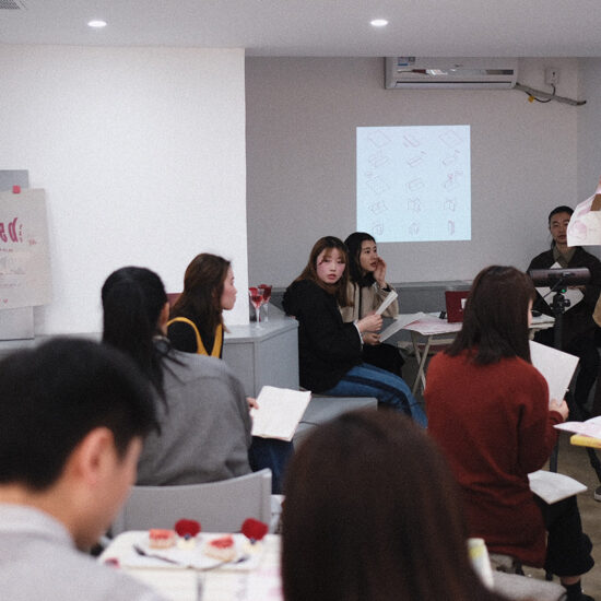
主讲人:童亦 设计师,Quinsay Design艺术指导。工作生活于杭州。Designer,Art director of Quinsay Design. Lives and works in Hangzhou.